A Newspaper for COVID-19 — The CoronaTimes
It seems that the way that I consume information has changed a lot. I have become quite a news junkie recently. One thing, in particular, is that I have been reading quite a lot of international news to determine the stages of Covid-19 in my country.
To do this, I generally visit a lot of news media sites in various countries to read up on the news. This gave me an idea. Why not create an international news dashboard for Corona? And here it is.
This post is about how I created the news dashboard using Streamlit and data from NewsApi and European CDC .
TLDR; Link to the App here .
Getting The Data
The most important thing while creating this Dashboard was acquiring the data. I am using two data sources:
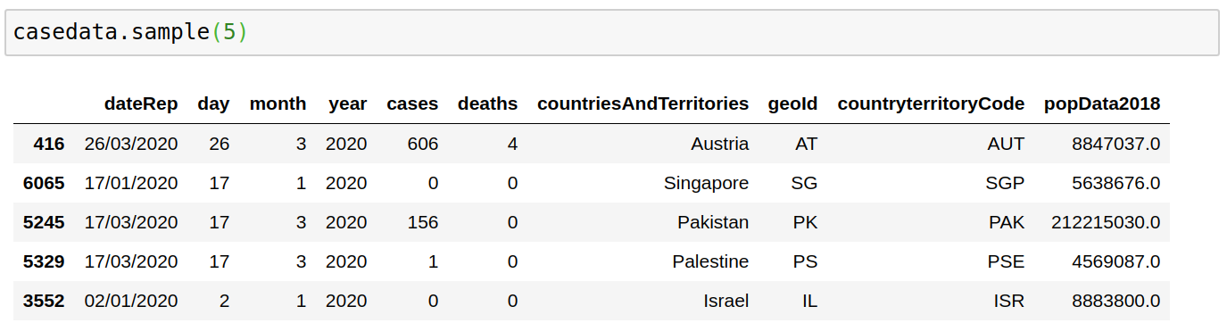
1. Data from the European Centre for Disease Prevention and Control.
The downloadable data file is updated daily and contains the latest available public data on COVID-19. Here is a snapshot of this data.
def get_data(date):
    os.system("rm cases.csv")
    url = "[https://opendata.ecdc.europa.eu/covid19/casedistribution/csv](https://opendata.ecdc.europa.eu/covid19/casedistribution/csv)"
    filename = wget.download(url,"cases.csv")
    casedata = pd.read_csv(filename, encoding='latin-1')
    return casedata
2. News API
The second source of data comes from the News API , which lets me access articles from leading news outlets from various countries for free. The only caveat is that I could only hit the API 500 times a day, and there is a result limit of 100 results for a particular query for free accounts.
I tried to get around those limit barriers by using streamlit caching(So I don’t hit the API a lot). I also tried to get news data from last month using multiple filters to get a lot of data.
from newsapi import NewsApiClient
newsapi = NewsApiClient(api_key='aedb6aa9bebb4011a4eb5447019dd592')
The primary way the API works is by giving us access to 3 functions.
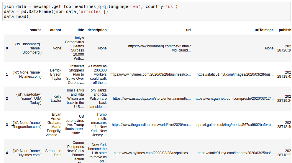
a) A function to get Recent News from a country:
json_data = newsapi.get_top_headlines(q=q,language='en', country='us')
data = pd.DataFrame(json_data['articles'])
data.head()
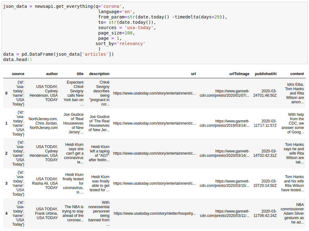
b) A function to get “Everything” related to a query from the country. You can see the descriptions of API parameters here:
json_data = newsapi.get_everything(q='corona',
                                    language='en',
                                    from_param=str(date.today() -timedelta(days=29)),
                                    to= str(date.today()),
                                    sources = 'usa-today',
                                    page_size=100,
                                    page = 1,
                                   sort_by='relevancy'
                                    )
data = pd.DataFrame(json_data['articles'])
data.head()
c) A function to get a list of sources from a Country programmatically. We can then use these sources to pull data from the “everything” API
def get_sources(country):
    sources = newsapi.get_sources(country=country)
    sources = [x['id'] for x in sources['sources']]
    return sources

sources = get_sources(country='us')
print(sources[:5])
-------------------------------------------------------------------
['abc-news', 'al-jazeera-english', 'ars-technica', 'associated-press', 'axios']
I used all the functions above to get data that refreshes at a particular cadence. You can see how I use these API functions in a loop to download the data by looking at my code at GitHub.
Creating the Dashboard
I wanted to have a few important information in the Dashboard that I was interested in. So I started by creating various widgets.
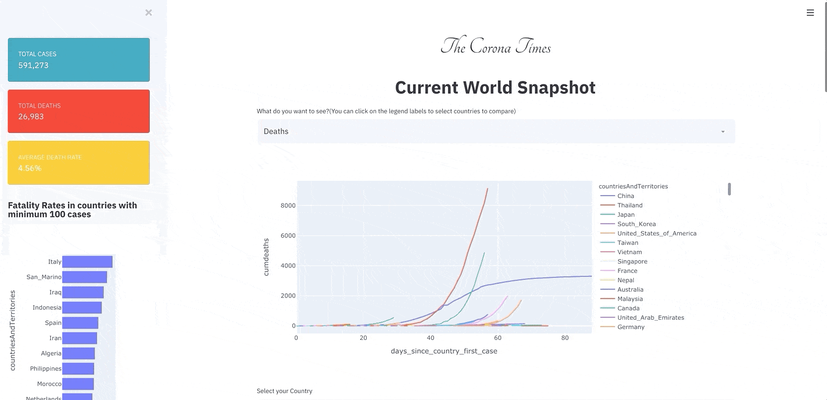
1. Current World Snapshot:
The first information was regarding the whole world situation. The Number of Cases and Deaths. The case and death curve in various countries? What are the fatality rates in various countries? Below is the current world situation on 28 Mar 2020.
Observations: We can see the deaths in Italy are still on the rise, while we are seeing the deaths shooting up in Spain, France, and the United States as well. The death rates in some countries are worrying with death rates of 10.56% in Italy and 8.7% in Iraq. I suspect that the death rate statistic of 2% in the starting days of CoronaVirus was misinformed if not wrong.
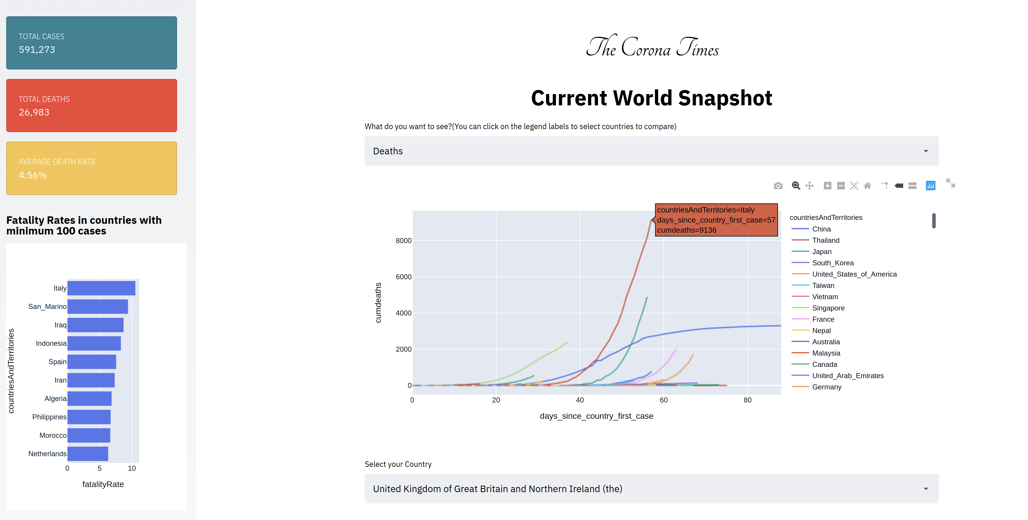
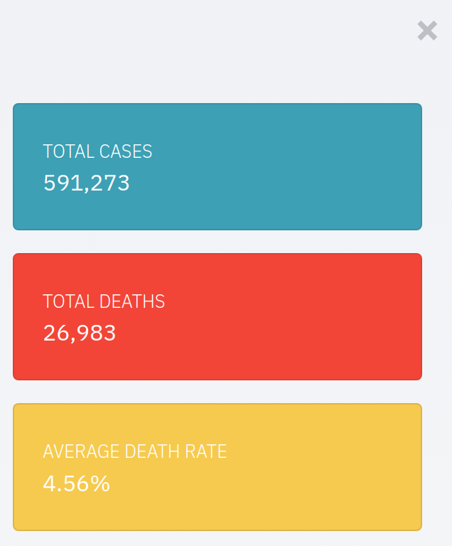
Technical Details — To create this part of the Dashboard, I used the ECDC data. I also used a lot of HTML hacks with Streamlit, where I used bootstrap widgets as well as custom HTML to get data in the way I wanted to display it. Here are a few of the hacks:
- Using Bootstrap Cards: You can use bootstrap or, in that case, any HTML element in Streamlit if you change the parameter unsafe_allow_html to True. Do note that I am also using python f string formatting here.
st.sidebar.markdown(f'''<div class="card text-white bg-info mb-3" style="width: 18rem">
  <div class="card-body">
    <h5 class="card-title">Total Cases</h5>
    <p class="card-text">{sum(casedata['cases']):,d}</p>
  </div>
</div>''', unsafe_allow_html=True)
The above code is behind the Dashboard styled cards in the streamlit app sidebar.
- Changed the width of the streamlit main page:
Again, there was no parameter given by streamlit to do this, and I was finding the page width a little too small for my use case. Adding the above code at the start of the app solved the issue.
st.markdown(
        f"""
<style>
    .reportview-container .main .block-container{{
        max-width: 1000px;
    }}
</style>
""",
        unsafe_allow_html=True,
    )
2. Most Recent News from Country
The primary purpose of creating this Dashboard was to get news from various outlets from top media outlets in the country.
Observations: As here you can see, here we have the top recent news from the United Kingdom concerning cases in Ireland and Boris Johnson’s corona woes.

Technical Details: As said before, I am using the News API to get this data. And here is how I am using a mashup of HTML and markdown to display the news results.
def create_most_recent_markdown(df,width=700):
    if len(df)>0:
        # img url
        img_path = df['urlToImage'].iloc[0]
        if not img_path:
            images = [x for x in df.urlToImage.values if x is not None]
            if len(images)!=0:
                img_path = random.choice(images)
            else:
                img_path = '[https://www.nfid.org/wp-content/uploads/2020/02/Coronavirus-400x267.png'](https://www.nfid.org/wp-content/uploads/2020/02/Coronavirus-400x267.png')
        img_alt = df['title'].iloc[0]
        df = df[:5]
        **markdown_str = f"<img src='{img_path}' width='{width}'/> <br> <br>"**
        for index, row in df.iterrows():
            **markdown_str += f"[{row['title']}]({row['url']}) by {row['author']}<br> "**
        return markdown_str
    else:
        return ''
Few things to note here:
The image width cannot be set using markdown so using custom HTML
The usage of python f strings to create the article titles and URLs.
If no image is found, we are defaulting to a custom image.
3. News Sentiment
Another thing that has been bothering me in these trying times is so much negativity everywhere. I wanted to see the news covered from a positive angle if it could be in any way. So I did some simple sentiment analysis using the custom sentiment analyzer from Textblob to do this.
I found out sentiments by news outlets as well as some of the most positive and negative news related to Coronavirus in the past 30 days. (Past 30 days because I cannot go more back with the free API).
Observations: As you can see that one of the most positive news is Trump changing his coronavirus stance on March 17th, and I agree. The second positive report seems to be regarding some sort of solution to the problem. While the first Negative news is regarding Cardi B slamming celebrities for sowing confusion about the Coronavirus. I won’t comment on this :)
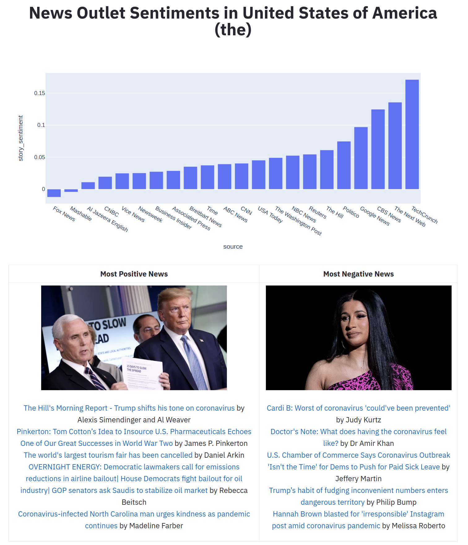
Technical Details: To get the sentiment scores of an article I used TextBlob. Getting the sentiment scores that range from -1 to 1 is as simple as using the below function. I used a concatenation of title and description to find the sentiment as the content from the News API was truncated.
def textblob_sentiment(title,description):
    blob = TextBlob(str(title)+" "+str(description))
    return blob.sentiment.polarity
The main difficulty here was to have a two-column layout to give both positive and negative news. For that again, I had to use a mashup of HTML and markdown. I used the HTML table to do this. Also, note how I used markdown to convert markdown to HTML using Python f strings.
import markdown

md = markdown.Markdown()

positive_results_markdown = create_most_recent_markdown(positivedata,400)

negative_results_markdown = create_most_recent_markdown(negativedata,400)

html = f'''<table style="width:100%">
                  <tr>
                    <th><center>Most Positive News</center></th>
                    <th><center>Most Negative News</center></th>
                  </tr>
                  <tr>
                    <td><center>**{md.convert(positive_results_markdown)}**</center></td>
                    <td><center>**{md.convert(negative_results_markdown)}**</center></td>
                  </tr>
                </table>'''
                #print md.convert("# sample heading text")

st.markdown(html,unsafe_allow_html=True)
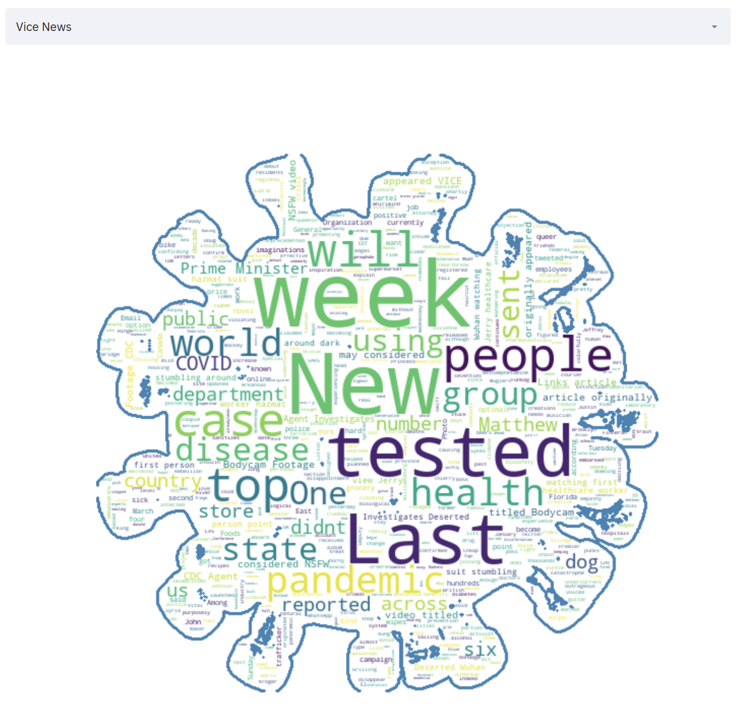
4. News Source WordCloud
A visualization dashboard that works with text is never really complete without a word cloud, so I thought of adding a word cloud to understand the word usage from a particular source.
Observations: We can see Vice news using words like “New” and “Tested” a lot of times. While Business Insider used “China” a lot.
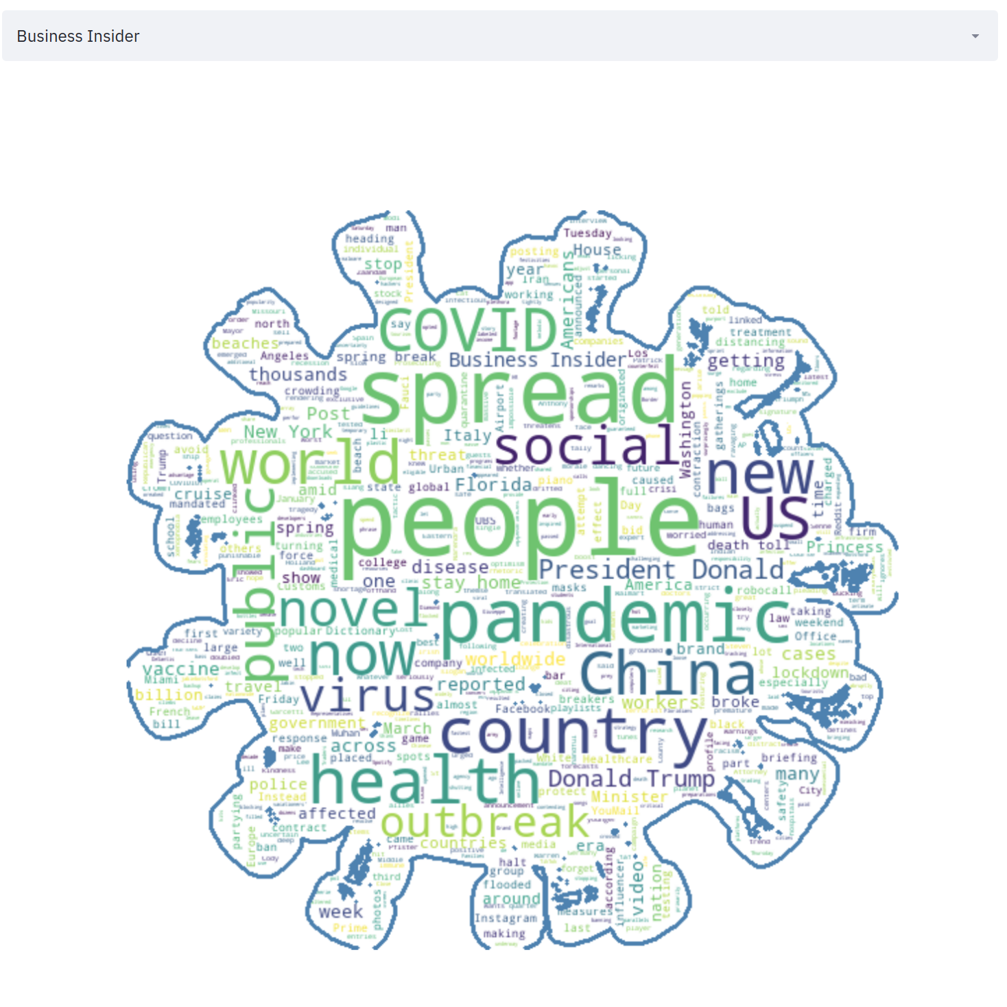 |  |
Technical Details: Here is what I used to create this masked word cloud:
import cv2

def create_mask():
    mask = np.array(Image.open("coronavirus.png"))
    im_gray = cv2.cvtColor(mask, cv2.COLOR_BGR2GRAY)
    _, mask = cv2.threshold(im_gray, thresh=20, maxval=255, type=cv2.THRESH_BINARY)
    mask = 255 - mask
    return mask

mask = create_mask()

def create_wc_by(source):
    data = fulldf[fulldf['source']==source]
    text = " ".join([x for x in data.content.values if x is not None])
    stopwords = set(STOPWORDS)
    stopwords.add('chars')
    stopwords.add('coronavirus')
    stopwords.add('corona')
    stopwords.add('chars')
    wc = WordCloud(background_color="white", max_words=1000, mask=mask, stopwords=stopwords,
               max_font_size=90, random_state=42, contour_width=3, contour_color='steelblue')
    wc.generate(text)
    plt.figure(figsize=[30,30])
    plt.imshow(wc, interpolation='bilinear')
    plt.axis("off")
    return plt

st.pyplot(create_wc_by(source),use_container_width=True)
Other Technical Considerations
1. Advanced Caching:
In new streamlit release notes for 0.57.0 which just came out yesterday, streamlit has made updates to st.cache. One notable change to this release is the “ability to set expiration options for cached functions by setting the max_entries and ttl arguments”. From the documentation :
max_entries (int or None) — The maximum number of entries to keep in the cache, or None for an unbounded cache. (When a new entry is added to a full cache, the oldest cached entry will be removed.) The default is None.
ttl (float or None) — The maximum number of seconds to keep an entry in the cache, or None if cache entries should not expire. The default is None.
Two use cases where this might help would be:
If you’re serving your app and don’t want the cache to grow forever.
If you have a cached function that reads live data from a URL and should clear every few hours to fetch the latest data
So this is what is being used in a lot of functions to avoid hitting APIs multiple times and to prevent them from getting stale at the same time.
For Example, Top results from a country are fetched at a period of 360 seconds i.e., 6 minutes.
st.cache(ttl=360,max_entries=20)
def create_dataframe_top(queries,country):
    #Hits API Here
While full results from the everything API are fetched at a period of one day.
[@st](http://twitter.com/st).cache(ttl = 60*60*24,max_entries=20)
def create_dataframe_last_30d(queries, sources):
    # hits API
2. Deployment:
I used the amazon free ec2 instance to deploy this app at http://54.149.204.138:8501/ . If you want to know the steps,read my post on How to Deploy a Streamlit App using an Amazon Free ec2 instance?
There are also a few caveats:
Since it is a free server, it might not take too much load.
I have not thoroughly tested the caching routine. I just hope that there are no memory errors with the limited memory on the server.
The News API is also free. There might be rate limits that might kick in even after I have tried to handle that.
3. Learning
For folks who are lost, you might like to start with the basics first. Here is my introductory posts on Streamlit and Plotly express.
- How to write Web apps using simple Python for Data Scientists?
- Python’s One Liner graph creation library with animations Hans Rosling Style
Conclusion
Here I have tried creating a dashboard for news on Coronavirus, but it is still in a nascent stage, and a lot needs to be done.
For one, it needs a large server. For another, a lot of time to improve the visualization and layouts. And also a lot of testing.
Also, we have done a few things in a roundabout way using HTML and few hacks. There are still a lot of things that I will love to have in Streamlit. I have been in talks with the Streamlit team over the new functionality that they are going to introduce, and I will try to keep you updated on the same. The good news is that Layout options are a part of the new functionality that Streamlit is working on.
You can find the full code for the final app here at my Github repo. And here is the full app on the web.
If you want to learn about the best strategies for creating Visualizations, I would like to call out an excellent course about Data Visualization and applied plotting from the University of Michigan, which is a part of a pretty good Data Science Specialization with Python in itself. Do check it out.
Thanks for the read. I am going to be writing more beginner-friendly posts in the future too. Follow me up at Medium or Subscribe to my blog .
Also, a small disclaimer — There might be some affiliate links in this post to relevant resources, as sharing knowledge is never a bad idea.
About Me

I’m a Machine Learning Engineer based in London, where I am currently working with Roku .
Know More